
Overview
Oddle is a rapid-growing online order management system built for seamless restaurant operations. It offers merchants to craft customized online menu easily without any manual input of code. The website for merchants aims to serve as the online store that handles orders, delivery, payment, database management, as well as sales and marketing reports. Because of the growing demand of online channels to interact with customers in the food & beverage industry, current website is facing challenges with remaining user-friendly and intuitive. As a transnational team, I worked on redesigning the ordering experience and collaborated closely with the Singapore-based product team.
Identify Challenges
Identify Challenges
Identify Challenges
Understand Current Experience
While also working as an account manager, I conducted 30 interviews with both of our customers and merchants to understand holistically about the current ordering experience.
Understand Current Experience
While also working as an account manager, I conducted 30 interviews with both of our customers and merchants to understand holistically about the current ordering experience.
Understand Current Experience
While also working as an account manager, I conducted 30 interviews with both of our customers and merchants to understand holistically about the current ordering experience.
“I ordered from a pizza place one day and I was trying to send the pizza I ordered to my friend but I just realized I can’t. I ended up sending her my receipt.”

“I ordered from a pizza place one day and I was trying to send the pizza I ordered to my friend but I just realized I can’t. I ended up sending her my receipt.”

“I ordered from a pizza place one day and I was trying to send the pizza I ordered to my friend but I just realized I can’t. I ended up sending her my receipt.”

“There’s a lot of steps while selecting options of one item but I can only adjust the amount of the customized item in my shopping cart.”

“There’s a lot of steps while selecting options of one item but I can only adjust the amount of the customized item in my shopping cart.”

“There’s a lot of steps while selecting options of one item but I can only adjust the amount of the customized item in my shopping cart.”

“I’m used to scroll all the way down to skip the pre-filled information when checkout. However, it seems I have to constantly click on multiple nexts to get to the final payment selection.”

“I’m used to scroll all the way down to skip the pre-filled information when checkout. However, it seems I have to constantly click on multiple nexts to get to the final payment selection.”

“I’m used to scroll all the way down to skip the pre-filled information when checkout. However, it seems I have to constantly click on multiple nexts to get to the final payment selection.”

We Discovered…
We Discovered…
We Discovered…
1
Unable To Advertise Or Share Single Item
Due to lack of individual item URL, merchants are not able to invest advertising only on specific seasonal items and users are not able to share an item on the menu through a specific link.
Frequent multitasking and manual data entry for clinicians limits the ability of the clinic to scale its service while maintaining quality to more patients in need.

1
Unable To Advertise Or Share Single Item
Frequent multitasking and manual data entry for clinicians limits the ability of the clinic to scale its service while maintaining quality to more patients in need.

1
Unable To Advertise Or Share Single Item
Frequent multitasking and manual data entry for clinicians limits the ability of the clinic to scale its service while maintaining quality to more patients in need.

2
Inefficient Flow For Item Customization And Checkout
Current product only allows user to adjust the item amount in the cart interface after you added a customized item to the cart. Also, current checkout page requires user to press multiple "Next" to proceed even when most information is already pre-filled.
Frequent multitasking and manual data entry for clinicians limits the ability of the clinic to scale its service while maintaining quality to more patients in need.

2
Inefficient Flow For Item Customization And Checkout
Frequent multitasking and manual data entry for clinicians limits the ability of the clinic to scale its service while maintaining quality to more patients in need.

2
Inefficient Flow For Item Customization And Checkout
Frequent multitasking and manual data entry for clinicians limits the ability of the clinic to scale its service while maintaining quality to more patients in need.

3
Lack Of Social References
There’s no information for any types of reviews on current product, which is critical for users before placing an order.
Frequent multitasking and manual data entry for clinicians limits the ability of the clinic to scale its service while maintaining quality to more patients in need.

3
Lack Of Social References
Frequent multitasking and manual data entry for clinicians limits the ability of the clinic to scale its service while maintaining quality to more patients in need.

3
Lack Of Social References
Frequent multitasking and manual data entry for clinicians limits the ability of the clinic to scale its service while maintaining quality to more patients in need.

Other Usability Issues
I also used heuristic evaluation and card sorting method to identify potential usability and current information structure problems.
Other Usability Issues
I also used heuristic evaluation and card sorting method to identify potential usability and current information structure problems.
Other Usability Issues
I also used heuristic evaluation and card sorting method to identify potential usability and current information structure problems.

Overwhelming Content
Cart interface is not collapsable and occupies precious horizontal space while sacrificing room for critical menu info in the middle.

Overwhelming Content
Cart interface is not collapsable and occupies precious horizontal space while sacrificing room for critical menu info in the middle.

Overwhelming Content
Cart interface is not collapsable and occupies precious horizontal space while sacrificing room for critical menu info in the middle.

Infrequent Information
Users rarely check on “Terms & Conditions“ at the navigation bar but we should be reminding user when checking out.

Infrequent Information
Users rarely check on “Terms & Conditions“ at the navigation bar but we should be reminding user when checking out.

Infrequent Information
Users rarely check on “Terms & Conditions“ at the navigation bar but we should be reminding user when checking out.

Unclear Error Page
Although current error page contains a CTA button to take user back to homepage, it failed to inform user on the potential cause of error.

Unclear Error Page
Although current error page contains a CTA button to take user back to homepage, it failed to inform user on the potential cause of error.

Unclear Error Page
Although current error page contains a CTA button to take user back to homepage, it failed to inform user on the potential cause of error.
Goals for Optimization
After understanding the current problems of the website and synthesizing my findings from the interviews, we want to address on 3 main goals for optimization:
Goals for Optimization
After understanding the current problems of the website and synthesizing my findings from the interviews, we want to address on 3 main goals for optimization:
Goals for Optimization
After understanding the current problems of the website and synthesizing my findings from the interviews, we want to address on 3 main goals for optimization:

Simplify Checkout Flow
There are a few potential issues that impede customers from checking out at ease, including the flow of item number adjustment and multi-stepped checkout page.

Simplify Checkout Flow
There are a few potential issues that impede customers from checking out at ease, including the flow of item number adjustment and multi-stepped checkout page.

Simplify Checkout Flow
There are a few potential issues that impede customers from checking out at ease, including the flow of item number adjustment and multi-stepped checkout page.

Include Social Components
The goal for this is to allow items to have individual share links for sharing and advertising purposes. We also want to introduce new section that includes pictures or reviews as social reference.

Include Social Components
The goal for this is to allow items to have individual share links for sharing and advertising purposes. We also want to introduce new section that includes pictures or reviews as social reference.

Include Social Components
The goal for this is to allow items to have individual share links for sharing and advertising purposes. We also want to introduce new section that includes pictures or reviews as social reference.

Refine Information Structure
According to our results from card sorting, we found numerous issues of our current categorization of information and the goal is to adjust them accordingly to achieve better browsing experience.

Refine Information Structure
According to our results from card sorting, we found numerous issues of our current categorization of information and the goal is to adjust them accordingly to achieve better browsing experience.

Refine Information Structure
According to our results from card sorting, we found numerous issues of our current categorization of information and the goal is to adjust them accordingly to achieve better browsing experience.
Persona
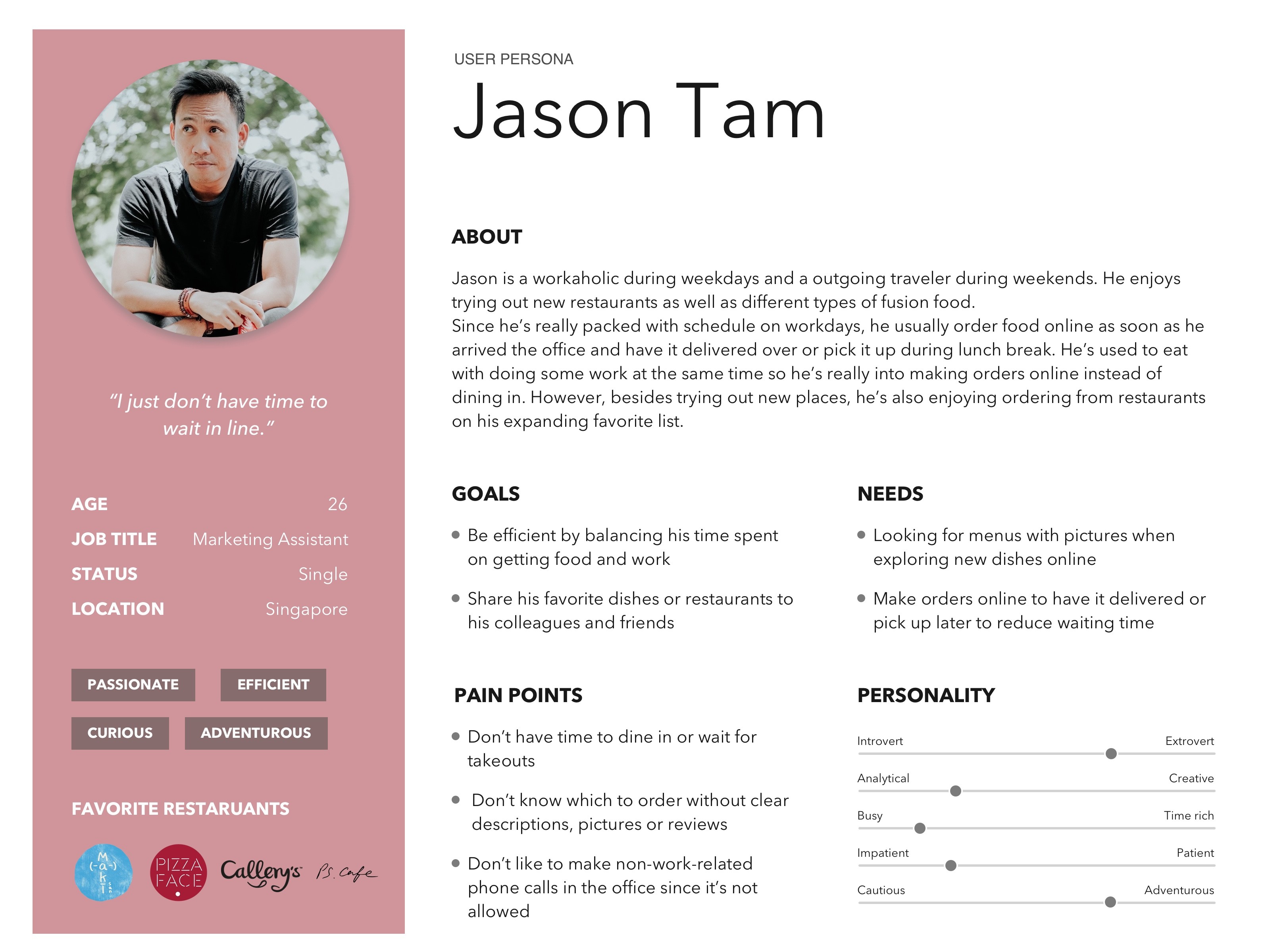
Based on our findings of the current problems and user’s expectations, I formed a primary user of our merchant websites to help us prioritize the user needs and goals.
Persona
Based on our findings of the current problems and user’s expectations, I formed a primary user of our merchant websites to help us prioritize the user needs and goals.
Persona
Based on our findings of the current problems and user’s expectations, I formed a primary user of our merchant websites to help us prioritize the user needs and goals.


Final Designs Solutions
Final Designs Solutions
Final Designs Solutions
1. Updated Add-Item UI
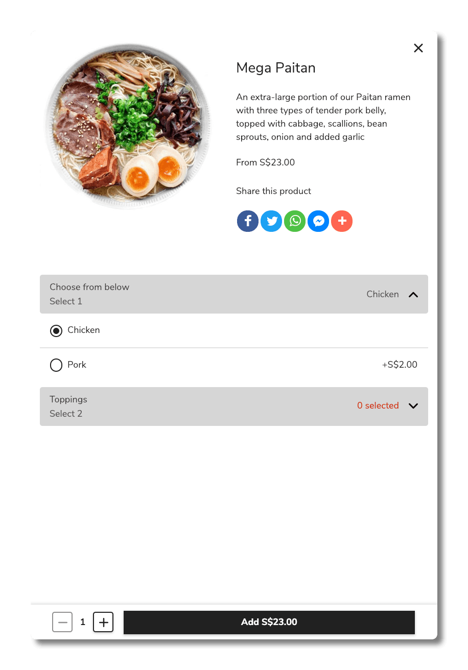
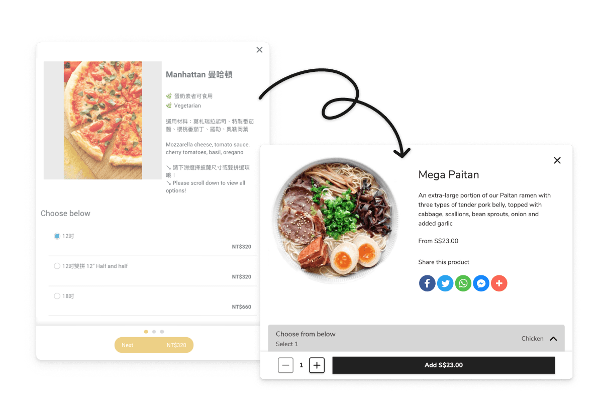
I added individual URL to each menu item for social media sharing and added item amount adjusting UI while adding items to the cart so the add-item UI can help user achieve more goals at the same time.
1. Updated Add-Item UI
I added individual URL to each menu item for social media sharing and added item amount adjusting UI while adding items to the cart so the add-item UI can help user achieve more goals at the same time.
1. Updated Add-Item UI
I added individual URL to each menu item for social media sharing and added item amount adjusting UI while adding items to the cart so the add-item UI can help user achieve more goals at the same time.


2. New Shopping Cart And Dining Preference Design
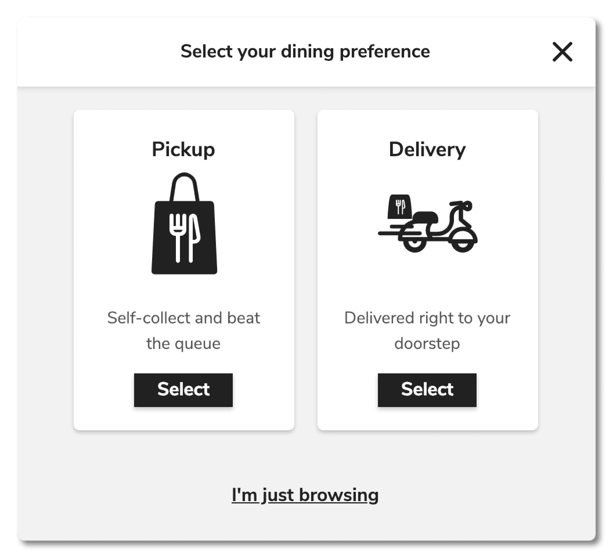
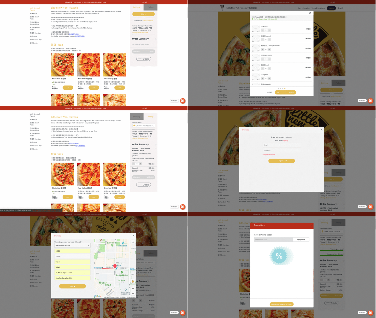
I proposed to replace current shopping cart UI with an expandable UI so we have more space to show menu items. In addition, instead of relying on users manually select dine in or delivery during checkout, I introduced the dining preference flow right after users add the first item to their cart.
Original Design

Original Design

Original Design

New Design(Dining Preference)

New Design(Dining Preference)

New Design(Dining Preference)

New Design(Shopping Cart)

New Design(Shopping Cart)

New Design(Shopping Cart)
3. Shorten Checkout Process
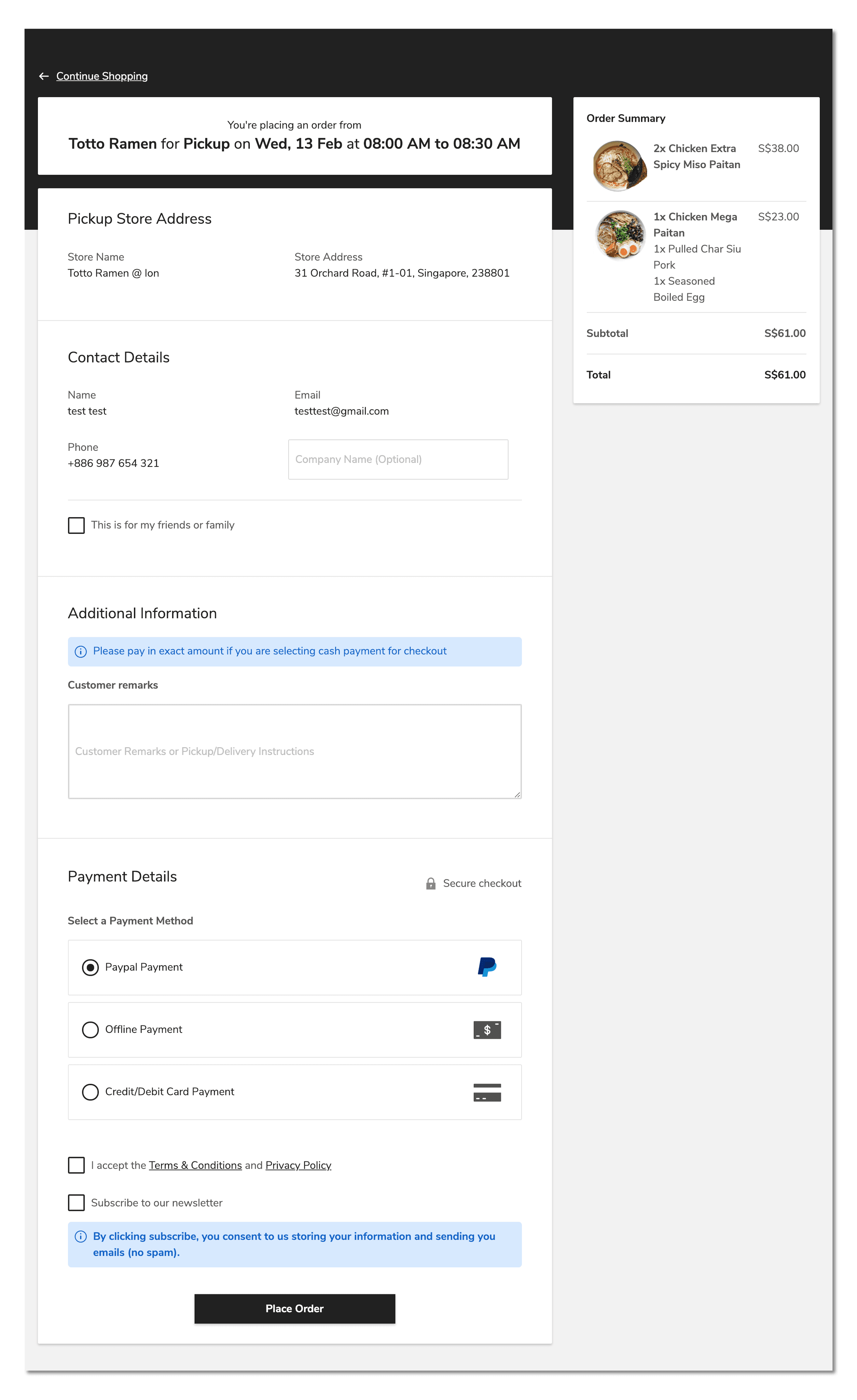
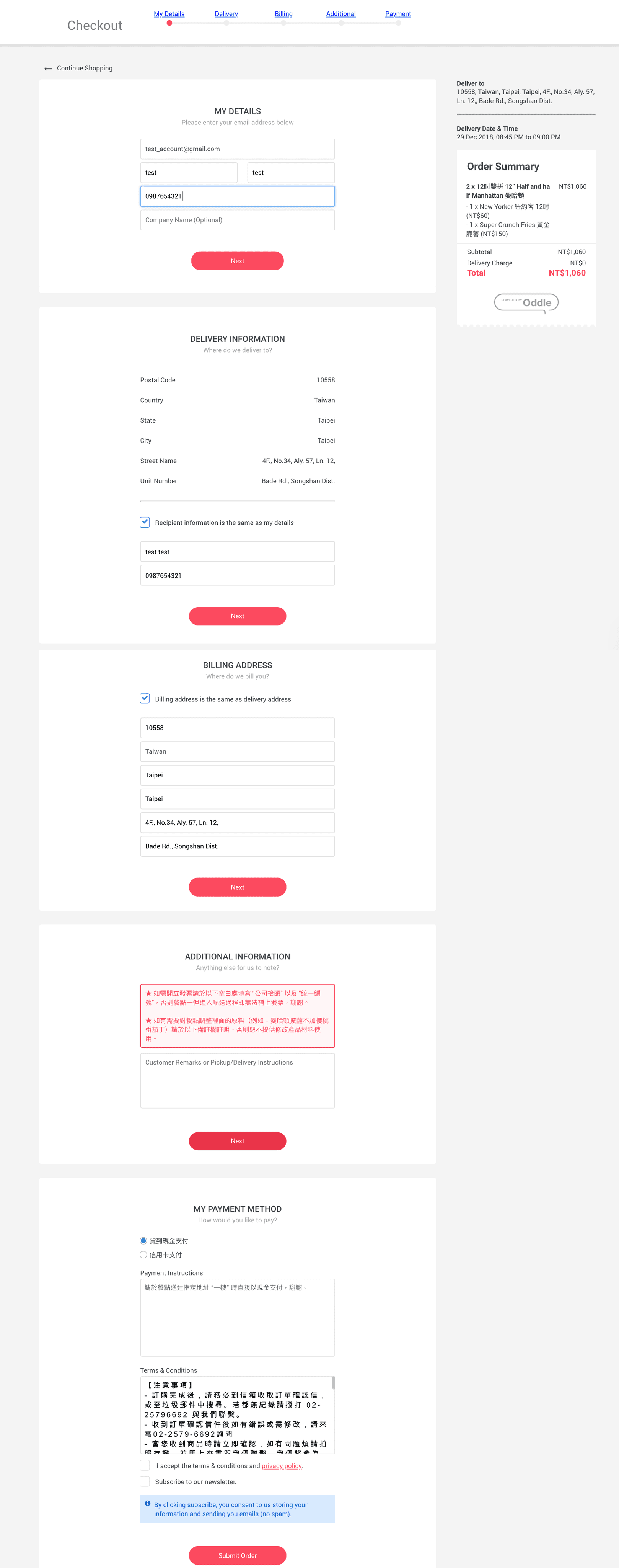
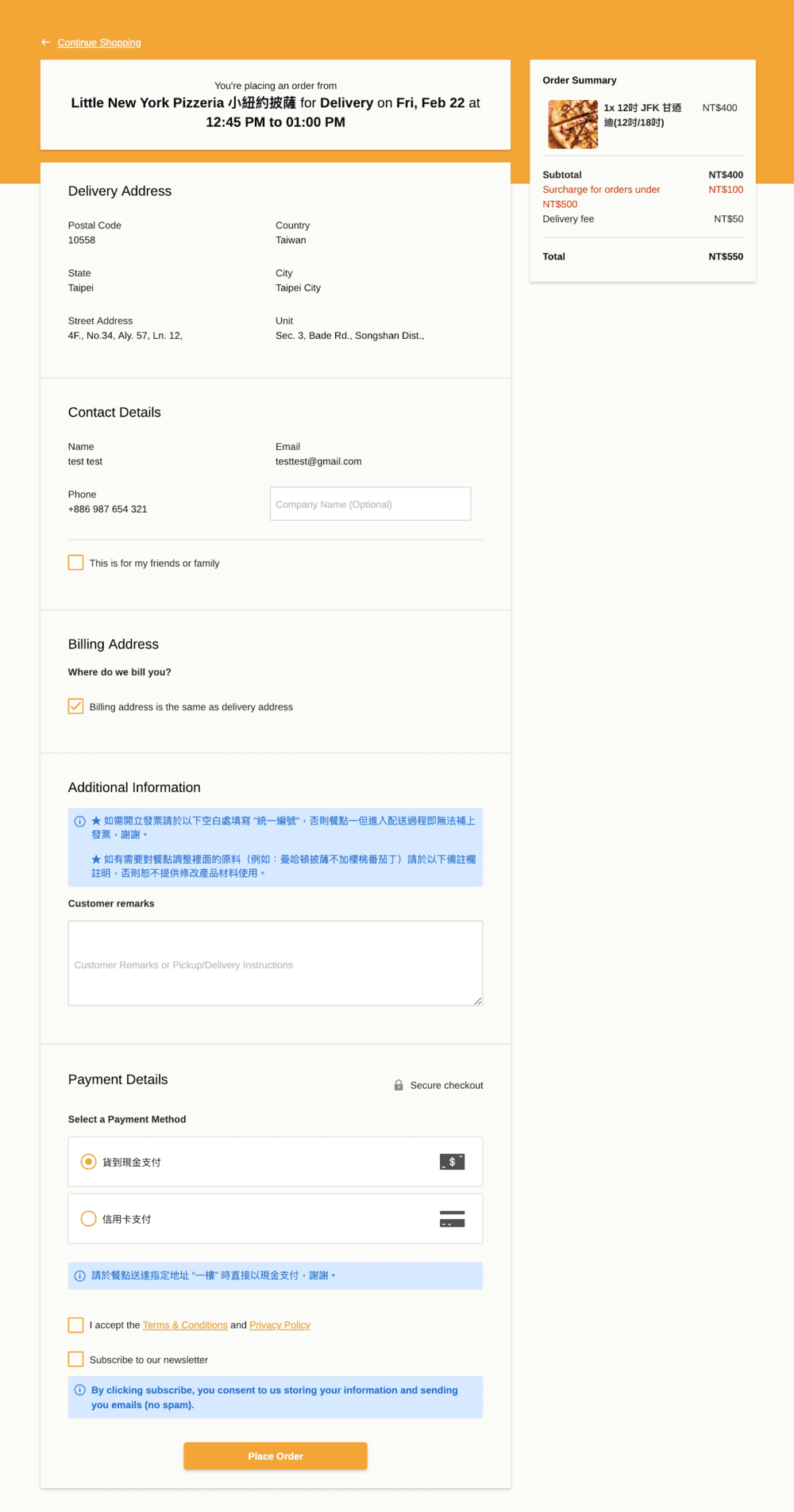
I removed all of the “Next” buttons but still group related information in blocks so that users can easily scroll to confirm all pre-filled information. Also, the order detail summary is now fixed to the top right so that customers can always check on order details and total amounts without scrolling back to the top.
Original checkout page
Original checkout page

Original checkout page

New checkout page
New checkout page

New checkout page

4. Navigation Bar Re-Design & Interactive Banner
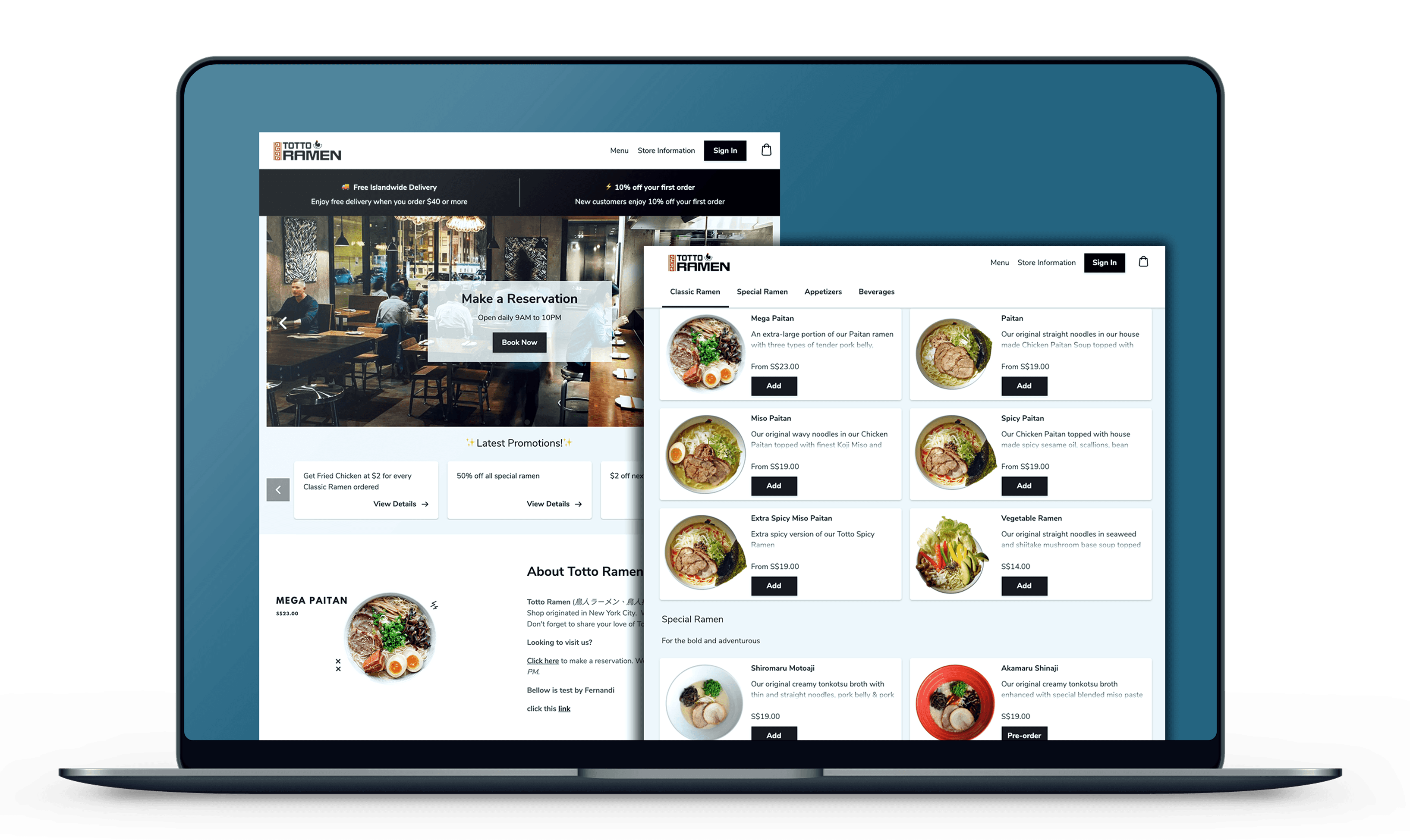
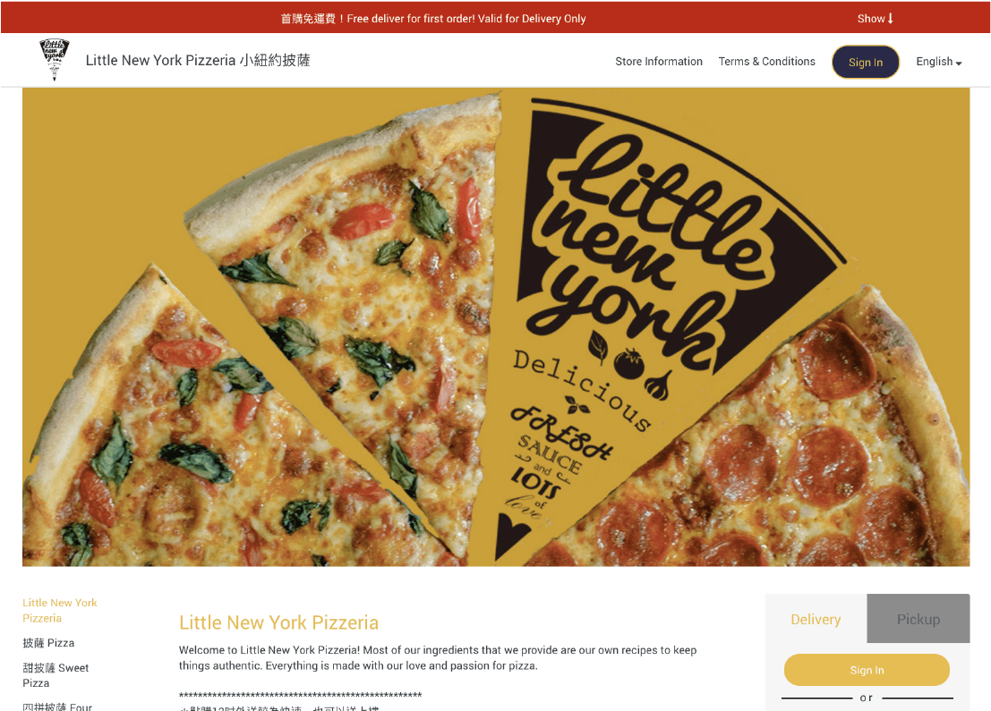
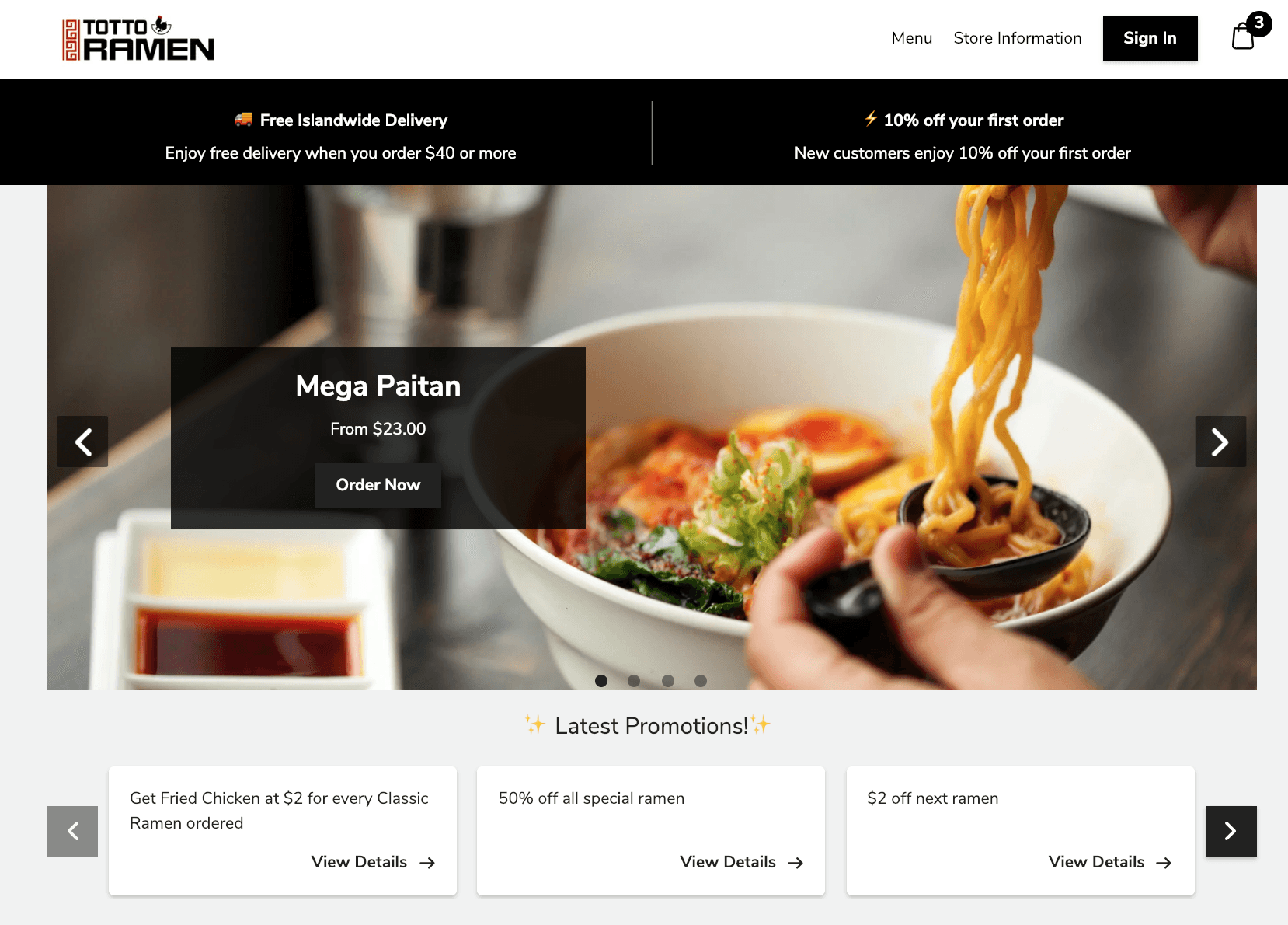
According to the result of card sorting, I removed the “Terms & Conditions” tab to page footer area and checkout page and added multiple banners with different CTA buttons for customers to directly interact with. Also, I changed the small notification bar for displaying promotions to larger blocks/cards of messages above and below the banners to differentiate constant promotions and seasonal promotions.
Original checkout page

Original checkout page

Original checkout page
New checkout page

New checkout page

New checkout page
5. Instagram Photo Integration
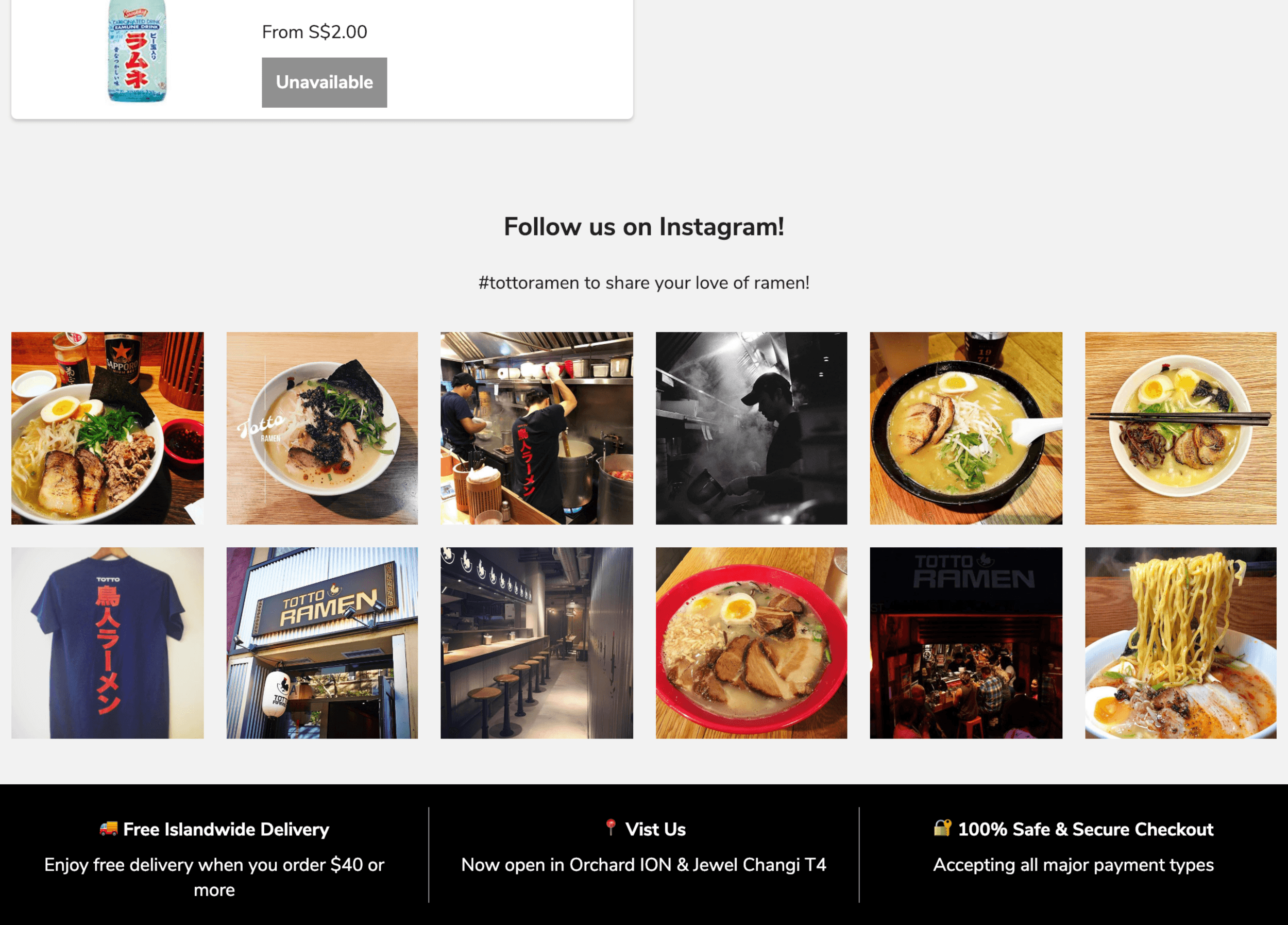
We decided to integrate merchant Instagram photos at the bottom of the page for users to check related posts of the restaurant and serve as a popular social media reference for public reviews.
Frequent multitasking and manual data entry for clinicians limits the ability of the clinic to scale its service while maintaining quality to more patients in need.
5. Instagram Photo Integration
Frequent multitasking and manual data entry for clinicians limits the ability of the clinic to scale its service while maintaining quality to more patients in need.
5. Instagram Photo Integration
Frequent multitasking and manual data entry for clinicians limits the ability of the clinic to scale its service while maintaining quality to more patients in need.


6. Adding Indication To Possible Error Causes
The original error page provides little information on how the error could have occurred. I updated the design with potential error-causing messages and highlighted the return button to better guide user away from error.
6. Adding Indication To Possible Error Causes
The original error page provides little information on how the error could have occurred. I updated the design with potential error-causing messages and highlighted the return button to better guide user away from error.
6. Adding Indication To Possible Error Causes
The original error page provides little information on how the error could have occurred. I updated the design with potential error-causing messages and highlighted the return button to better guide user away from error.
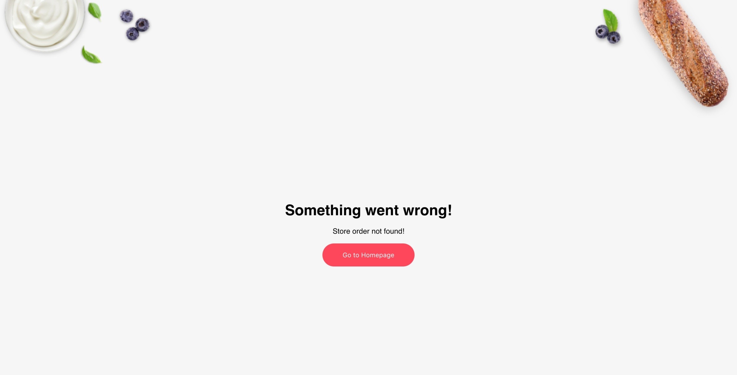
Old 404 page

Old 404 page

Old 404 page
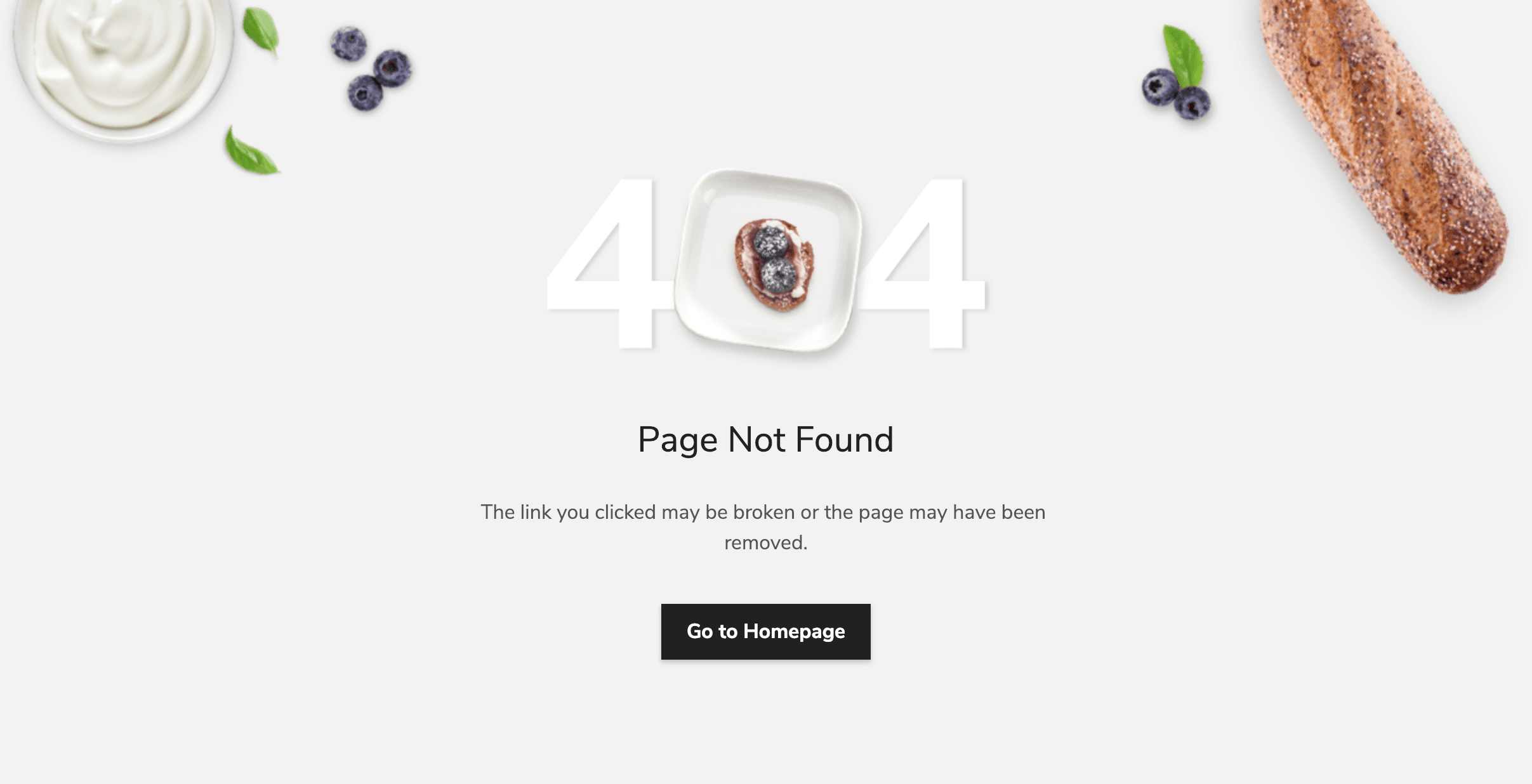
New 404 page

New 404 page

New 404 page
Final Design Mockups
Final Design Mockups
Final Design Mockups


